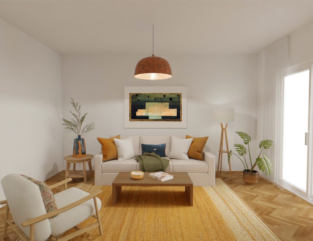
Cómo aplicar una paleta de color – Parte II
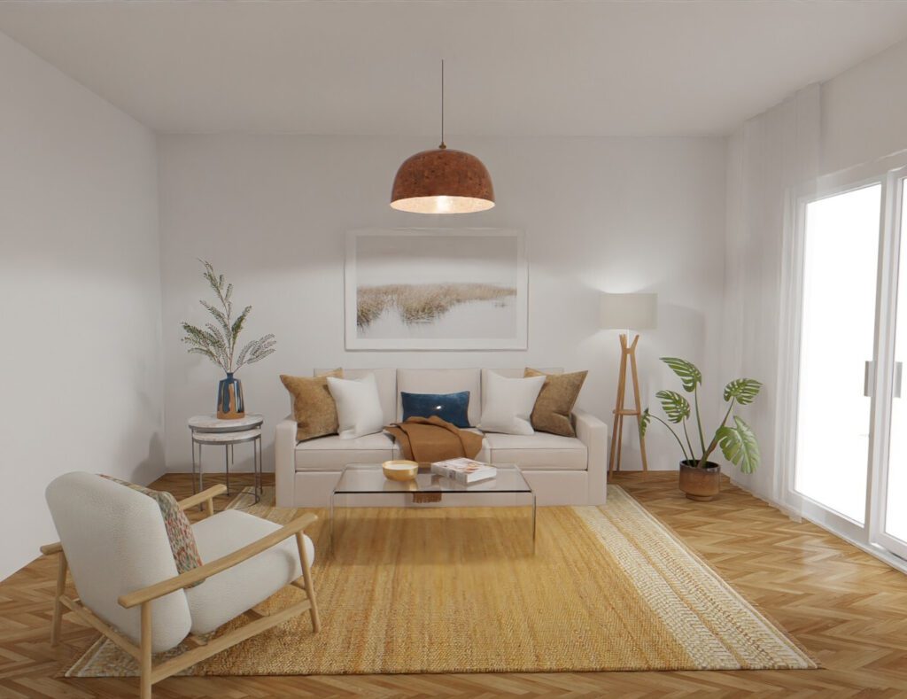
como aplicar una paleta de color

Menu ASESORÍAS MIS SERVICIOS CURSO DECO SOBRE MÍ NEWSLETTER BLOG CONTACTO Cómo aplicar una paleta de color en cualquier ambiente – PARTE II   El mes pasado empezamos a ver cómo aplicar una paleta de color para que se sienta balanceada e integrada al espacio. Si no lo leíste, te recomiendo que empieces por ahí porque así esta segunda parte va a tener más sentido porque sentamos las bases de lo que vamos a charlar hoy.    En esa edición nos concentramos puramente en el color, ¿pero qué pasa con las texturas? EXPERIMENTEMOS UN POCO   Las texturas influyen muchísimo en cómo percibimos los colores y me gustaría ejemplificártelo también usando el mismo ambiente que en la edición anterior. Tal como los colores, también podemos dividirlas en frías y cálidas. Las frías van a ser las que tengan brillo y superficies pulidas: vidrio, marmol y piedras en general, metales, textiles con brillo como el cuero, laqueados, etc. Pensá en una oficina ejecutiva modernosa. Las cálidas van a ser las que tengan un acabado más rústico: pinturas mate, textiles como el algodón o el lino, fibras naturales, superficies rugosas. Pensá en el estilo boho.  Entonces, acá nos quedamos en la edición anterior : Lo que quiero probar ahora es qué pasa si tomamos este mismo color cálido, el naranja, pero usamos solamente texturas frías. No se siente tan cálido ahora, ¿no? Acá hay muchísimas texturas frías porque cambié hasta el piso, y en este caso por cantidad le ganan a lo cálido de los objetos naranjas. ¿Y qué pasa si probamos lo opuesto? Elementos sólo de un color frío, como el azul, con texturas puramente cálidas. Ya no se siente tan frío tampoco, las texturas cálidas lo balancearon bastante. Tené en cuenta igual que un render siempre se va a sentir un pelín frío compararado con la realidad. Yendo a algo menos extremo, si volvemos a nuestra imagen original y, por ejemplo, no queremos el cuadro en tonos fríos, podríamos balancearlo con la textura de algunos elementos. Voy a probarlo con la mesa ratona y la auxiliar, que son objetos medianos si pensamos en el tamaño. Es otra forma de balancear los cálidos y también funciona. Es cuestión de ir buscando el punto que nos gusta y que sentimos que tiene que ver con nuestro estilo. Si sentís que el ambiente se siente muy pesado o anticuado, algunas texturas frías te pueden ayudar a modernizarlo. Funciona también al revés: si se te fue la mano con lo moderno, podés darle un toque más hogareño con texturas cálidas.  Como verás, es un tema bastante complejo como para resumirlo en un posteo de Instagram con tres tips, por eso quería ir más en profundidad y ejemplificarlo con estas imágenes que quizás sean un poco exageradas, pero me parece que grafican mejor el tema.  Si te quedaste con ganas de aprender más, estos son algunos de los temas que vemos más en profundidad en mi curso online junto con muchos otros, como las reglas básicas del diseño, armar una correcta distribución, los distintos estilos y cómo encontrar el propio e incluso cómo armar tu modelo 3D online fácil con una web gratuita Chusmeá el curso acá

Cómo aplicar una paleta de color

Menu MIS SERVICIOS CURSO DECO SOBRE MÍ NEWSLETTER BLOG CONTACTO Cómo aplicar una paleta de color en cualquier ambiente.   Para esta edición se me ocurrió que podíamos volver al tema color. No me pongas esa cara de pánico, sé que es un tema difícil, pero vamos a ir de a poco y con ejemplos. Eso sí, esta edición va a ser más bien larga, asi que sugiero te prepares algo rico para tomar, yo te espero. ¿Arrancamos?  “Me da miedo cansarme” Hace unos días pregunté en Instagram si tenían miedo de usar color en sus casas y por qué, y la abrumadora mayoría de las respuestas eran que tenían miedo de cansarse, que es también una respuesta que escucho mucho en las asesorías.  ¿Y sabés qué? Sí, te vas a cansar. Las personas cambiamos constantemente. Si es normal que nos aburramos de nuestra profesión, de nuestros hobbies, salidas, ropa y hasta a veces de nuestras parejas, ¿por qué pretendemos que la deco del living nos enamore para siempre? Y por otro lado, ¿por qué nadie tiene miedo de aburrirse de los neutros? Sí, ya sé. Nos taladraron toooda la vida que es más fácil la base neutra y sumar color después. ¿Pero sabés qué? Decorar con neutros no es fácil. De hecho, es bastante difícil. Tenés que saber manejar muchas otras variantes para que el espacio se sienta interesante. Y además, no todos los neutros se llevan bien entre sí. (Perdón si te acabo de complicar la existencia, pero te lo tenía que decir) Quizás lo que tenemos que hacer es apuntar a no cansarnos rápido. Si pasaron 3 meses y el color de la pared no lo aguanto más, sí, metí la pata. Ahora, si me canso en 4/5 años es normal. De hecho, aunque el color sea perfecto tendría que volver a pintar porque como todas las otras cosas en la vida, la pintura no dura para siempre.  Entonces, para evitar cansarnos rápido de los colores es importante que tengamos en cuenta no solamente cuáles vamos a elegir, sino cómo los vamos a aplicar. Ojo con esto Los colores más saturados tienden a cansarnos más fácil, más que nada porque exigen más de nosotros, nos ponen un poco en alerta. También son más dinámicos, por lo que si queremos usarlos, es mejor aplicarlos en espacios donde trabajamos o hacemos tareas, y no tanto en los lugares donde descansamos.    Salvo en casos puntuales donde hay un claro amor por tonos súper saturados (o en locales comerciales), suele ser mejor elegir alguna versión un poco más desaturada (es decir, que tiene más cantidad de gris en su composición) y en todo caso complementar con detalles más chicos en versiones más intensas. Esto además nos suma profundidad al usar distintas versiones de un color.  Este es el estudio de Sebastian Curi y Macarena Luzi. Tiene muchísimos colores saturados, pero funciona porque es un espacio de trabajo y además tenemos áreas de descanso para la vista. Otros colores que fácilmente nos cansan rápido son los colores que están de moda. En general, es como que nos ganan por cansancio. Los vemos en todos lados, nos empiezan a gustar, pero el tema es que como los seguimos viendo tanto nos hartamos y ahí es donde nos empiezan a aburrir.  Mi sugerencia es elegir colores que nos gustan hace tiempo, que ya venimos usando en otras cosas, y vamos a tener muchas menos chances de que nos aburra. Por otro lado, siempre es bueno hacer una prueba para ver cómo queda ese color con la luz de tu casa y cómo te sentís vos al verlo. Cuando te comprás ropa en general te la probás primero. Esto sería algo similar.   ¿PERO CÓMO LO USO? Lo mejor es que lo veamos con un ejemplo. Empecemos con una habitación súper neutra, blanco y madera. Puse muebles bien tranquis y armé lo básico, para que no nos distraiga. Supongamos que queremos empezar a sumarle toques de color y probamos aplicarlo en algunos accesorios. Es lo que nos dicen siempre, ¿no? Base neutra, toques de color. Voy a usar naranja, que es un color que suele ser más difícil de usar. La verdad es que no se siente un gran cambio. Se sigue viendo bastante plano y básico. ¿Por qué no funciona? Para empezar, tenemos un problema de escala. Los toques de color son insuficientes y no aportan la cantidad necesaria para balancear el ambiente.  ¿Qué pasa si para ahorrarnos este problema ponemos el color en las paredes y listo? Parece la simulación de las páginas de pintura cuando querés probar cómo quedaría un color. O el set de una publicidad de Mr Músculo. Esto es como si hicieras una fiesta de cumpleaños y todas las personas estuvieran sentadas en la mesa hablando solas. Hay una completa desconexión entre los elementos. Nosotros queremos que la gente charle. Los elementos del ambiente tienen que hablar unos con otros, necesitamos puntos de conexión.  Por otro lado, el ambiente se sigue sintiendo plano. No hay diferentes tonos ni texturas. ¿Cómo lo podemos arreglar? Primero, pensando en variaciones del naranja, como caramelo, marrón, cobre incluso, o variedad en los tonos de madera. Esto nos va a dar profundidad y dimensión. Además, deberíamos aplicarlo en más elementos que el primer ejemplo. OK, acá ya va mejorando, pero sigue sin terminar de sentirse completo. ¿Por qué? Tenemos neutros y colores cálidos. Necesitamos toques de algún color frío para balancear y sumar interés al ambiente. Ahhh, mucho mejor. Sigue siendo un ambiente súper sencillo, pero se ve más cómodo y con más aire. Cuando usamos solamente tonos cálidos, los ambientes se empiezan a sentir un poco sofocantes, por eso los tonos fríos nos dan puntos de alivio. Y pasa lo mismo al revés, si usamos solamente colores fríos el espacio se puede empezar a sentir un poco distante y nos va a faltar el toque que lo haga más hogareño. Espero que estos ejemplos te hayan servido para poder visualizar mejor cómo podés corregir problemas usuales de paleta de color.

MY LIVING ROOM – BEFORE & AFTER

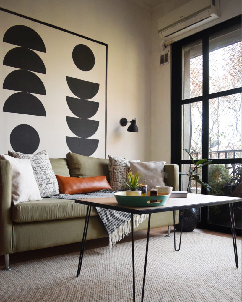
my LIVING room- before & after Anterior Siguiente Everything started with the faux wood wall. I wanted this room to be a more accurate reflection of who I am as a decorator. Is where I spend most of my free time. Yes, it had already undergone some changes. When I first mooved in the walls were baby yellow, the floors were dark and worn out, and the balcony doors didn’t close properly. First came the white paint. That’s when the room started to feel fresher. Then came the new balcony doors. That change felt radical to me. I actually loved it so much that I took the curtains out. In January 2020 I installed the new floors. They are luxury vynil planks and I installed them myself. It seemed easy, you can cut them with an x-acto knife, and you glue them down. But as I was changing the floors for the entire house, it took me MONTHS. I don’t regret it at all, but if you are thinking of doing the same at home, please take a break every half hour, stretch, and then continue. Your back will thank you. At this point the space had changed a lot and I felt much more comfortable. But there was still something missing. I didn’t think it represented what I was capable of doing as a designer, so I started to make some extra changes. Anterior Siguiente This is what the living room looked like with the first round of changes. This is how the new changes started, with the faux wood wall, in January 2022. I wanted to do something special with that wall, but I had a hard time deciding what. I had started building a 3D model of the room and wasn’t sold on any idea, until this. The material is the same as the floors, just a little darker because it’s from a different batch. The install was really quick (three hours tops) and now I started to fell the room taking shape, leaning closer to my style. When I was happy with the 3D model I started making a list of all the tasks I had to do, and also the budget that I needed. Little by little, I started completing them: 👉Painted the door the same colour as the bathroom vanity 👉Reupholstered the sofa and the armchair 👉Made new chushion covers 👉Bought a rug that was the right size for the room (I had two sticked together before!) 👉Hung the TV and added two shelves for books 👉Painted and reupholstered the chairs 👉Painted over the geometric mural and created new art 👉Covered the hutch at the entrance with faux wood vynil and made a new top for it It took me months, but having an actual list of the tasks helped me a lot to realize how far along I was and what thing, even if it was something really small, I could do to continue. This is how it turned out. Anterior Siguiente If this transformation sparked your need to make some changes in your own home, I can help! Check out my online consultations. i want to know more

MY BATHROOM – BEFORE & AFTER

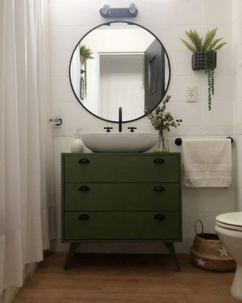
my bathroom – before & after The first thing I did was to paint the ceiling. PRO TIP: when you are renovating a room, it’s ideal to start from top to bottom. Then, I painted the tile. I used Sherwin Williams’ tile paint, but know there are more options available: Zinsser Bulls Eye 1-2-3 primer, and even chalk paint. The next step was to take out the medicine cabinet and the built in lights. It was a little difficult because the screws were really old and rusted, and some even broke, but with some patience we were able to take it out. I replaced it with a round mirror (bought online) and a new light fixture. That change alone gave me a lot of faith in the final outcome. Then, I had to take care of the vanity. I searched long a hard for one, but didn’t really like any of the options (or found them incredibly expensive). So I opted for buying an inexpensive pine dresser and a countertop basin. I drilled the holes I needed for the faucet and water line conections, and modified de drawers to accommodate the pipes. Also, I painted the dresser with synthetic enamel and installed new drawer pulls. And finally, I took care of the floors. At first, I used some tile stickers, but they weren’t floor specific and the deteriorated over time (learn from my mistakes! haha), so I made the decision to install the same vynil planks as the rest of the house. And that was it! The rest are decor touches. Previous Next If this transformation sparked your need to make some changes in your own home, I can help! Check out my online consultations. i want to know more

LUCILA’S ONLINE CONSULTATION – BEFORE & AFTER
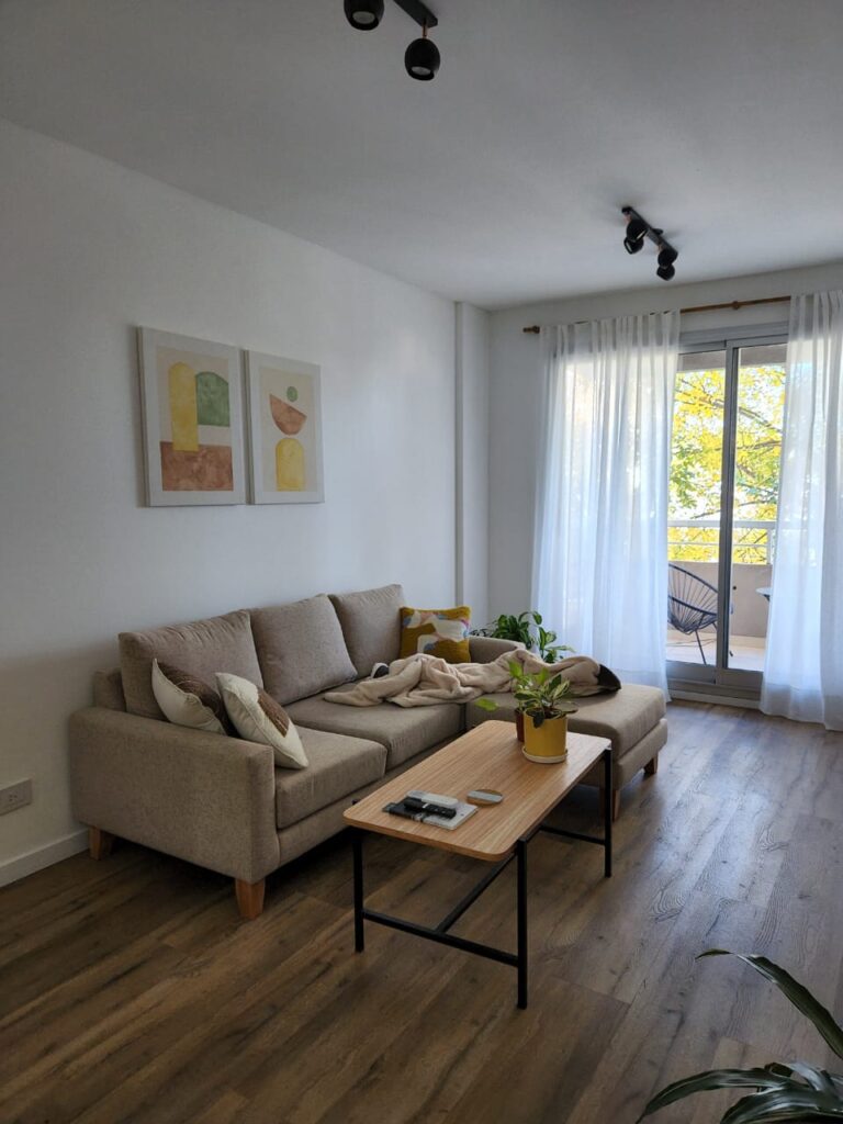
before & after – lucila’s online consultation In Lucila’s case, we started with a blank canvas. She didn’t have any furniture, so she wanted to think ahead and make smart purchases. The idea was to create a dining area and living room area, adding some storage space and a bookcase. She asked for a neutral colour palette, with some pops of colour and lots of wood. This was my proposal. Previous Next I created the dining sector next to the kitchen, with the table centered in the space, and a hutch creating a bar area, adding some storage space. Then I created the living room area, with a sectional, a coffee table, media console and bookcase. Having these images as a starting point and knowing the furniture sizes that work best with the room, Lucila gave it her touch. She even painted her own art! Look how beautiful the space turned out. Previous Next If this transformation sparked your need to make some changes in your own home, I can help! Check out my online consultations. i want to know more

GALA’S ONLINE CONSULTATION – BEFORE & AFTER
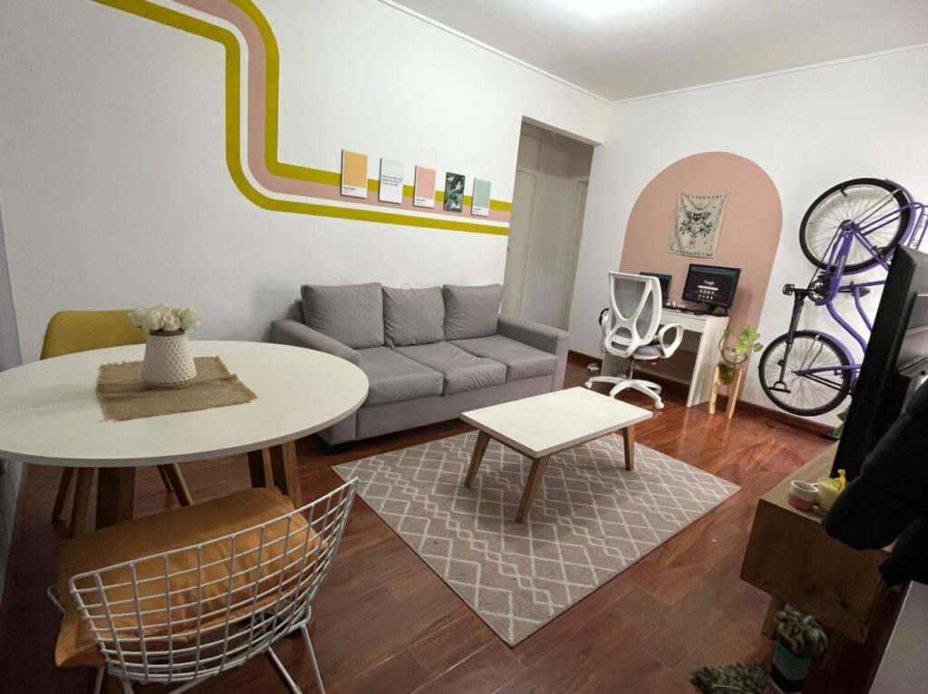
before & after – gala’s online consultation Gala contacted me because, even though she liked her furniture and accesories, she felt it didn’t hace a cohesive look. We needed a common thread. Having a small budget, I wanted to think of an alternative that could be done mainly with paint, so we could get a big bang for our bucks. She also needed a WFH area and a place to store her bike. This was my proposal: Previous Next I created a mural that conected the dining and living room walls, giving it a fresh look by taking the color palette we already had. Also, I created a WFH area painting a pink arch and using a tapestry she already had on hand. I hung the bike next to it, making it accesible, but allowing a better circulation overall. I reutilized absolutly everything she had. Look how beautiful it turned out. https://decowlasen.com/wp-content/uploads/2022/08/WhatsApp-Video-2022-08-16-at-4.15.14-PM.mp4 Previous Next If this transformation sparked your need to make some changes in your own home, I can help! Check out my online consultations i want to know more

MY KITCHEN – BEFORE & AFTER

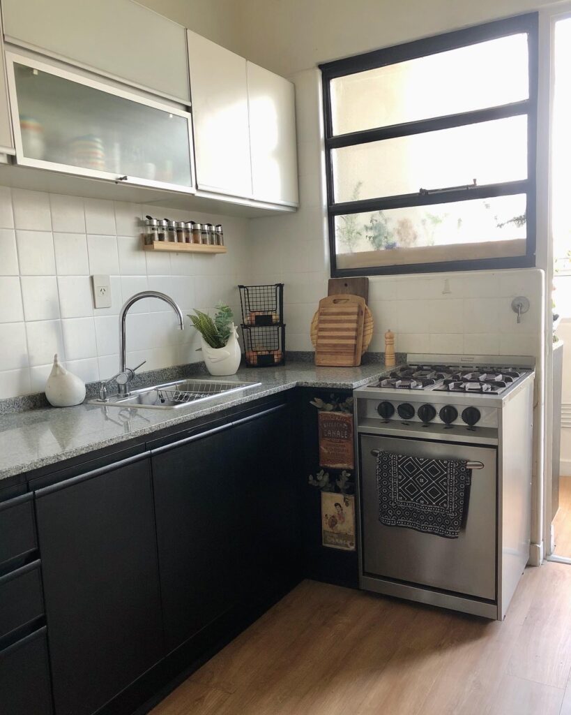
my kitchen – before & after The BEFORE The first thing I did when I moved into this house was to pain the kitchen tiles. I needed al least one of the colors to dissapear, because it was driving me crazy. About 3 months later, I changed the cabinets, because as you can see they were coming apart. I took the oportunity to expand the countertop, using the space that was meant for the fridge (mine didn’t fit). At that time, I painted the floors with a geometric design in white and gray, but I made a lot of mistakes and in a few months it started to deteriorate. When I bought the luxury vynil planks for the rest of the home, I thought the wood look would bring some much needed warmth to the space and I really love how it turned out. Later, I added the wood bar, so as to have a little bit more counter space. But something wasn’t clicking yet, and it was the tiled wall. So what did I do? I filled in the grout, sanded, suffered along with my dusty home, and then suffered some more while I cleaned the dust up. Once the sanding part was done, I primed the wall (don’t skip this step), and then painted it with a faux cement effect. That gave me the perfect background for a black and white gallery wall. What do you think of the final resault? ANTES Here you can compare the BEFORE and AFTER.  The complete AFTER. If this transformation sparked your need to make some changes in your own home, I can help! Check out my online consultations. i want to know more